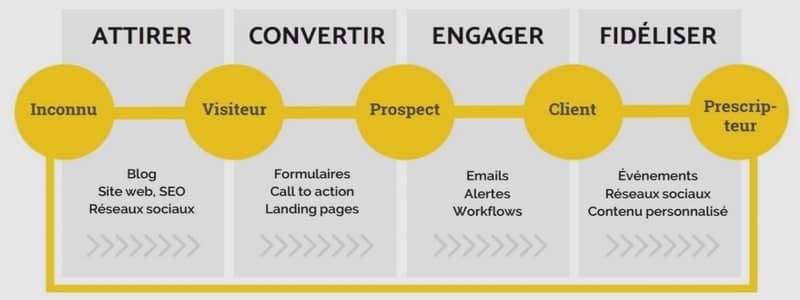
Bootstrap Grid System
Grid systems are used for creating page layouts through a series of rows and columns that house your content. Here’s how the Bootstrap grid system works:
– Rows must be placed within a .container class for proper alignment and padding.
– Use rows to create horizontal groups of columns.
– Content should be placed within columns, and only columns may be immediate children of rows.
– Predefined grid classes like .row and .col-xs-4 are available for quickly making grid layouts. LESS mixins can also be used for more semantic layouts.
– Columns create gutters (gaps between column content) via padding. That padding is offset in rows for the first and last column via negative margin on .rows.
– Grid columns are created by specifying the number of twelve available columns you wish to span. For example, three equal columns would use three .col-xs-4.
Media Queries
Media query is a really fancy term for « conditional CSS rule ». It simply applies some CSS based on certain conditions set forth. If those conditions are met, the style is applied.
Media Queries in Bootstrap allow you to move, show and hide content based on viewport size.
Following media queries are used in LESS files to create the key breakpoints in the Bootstrap grid system.
…
 Si le lien ne fonctionne pas correctement, veuillez nous contacter (mentionner le lien dans votre message)
Bootstrap (1,93 MO) (Cours PDF)